Building an Open-Source Design System for Enterprise Teams
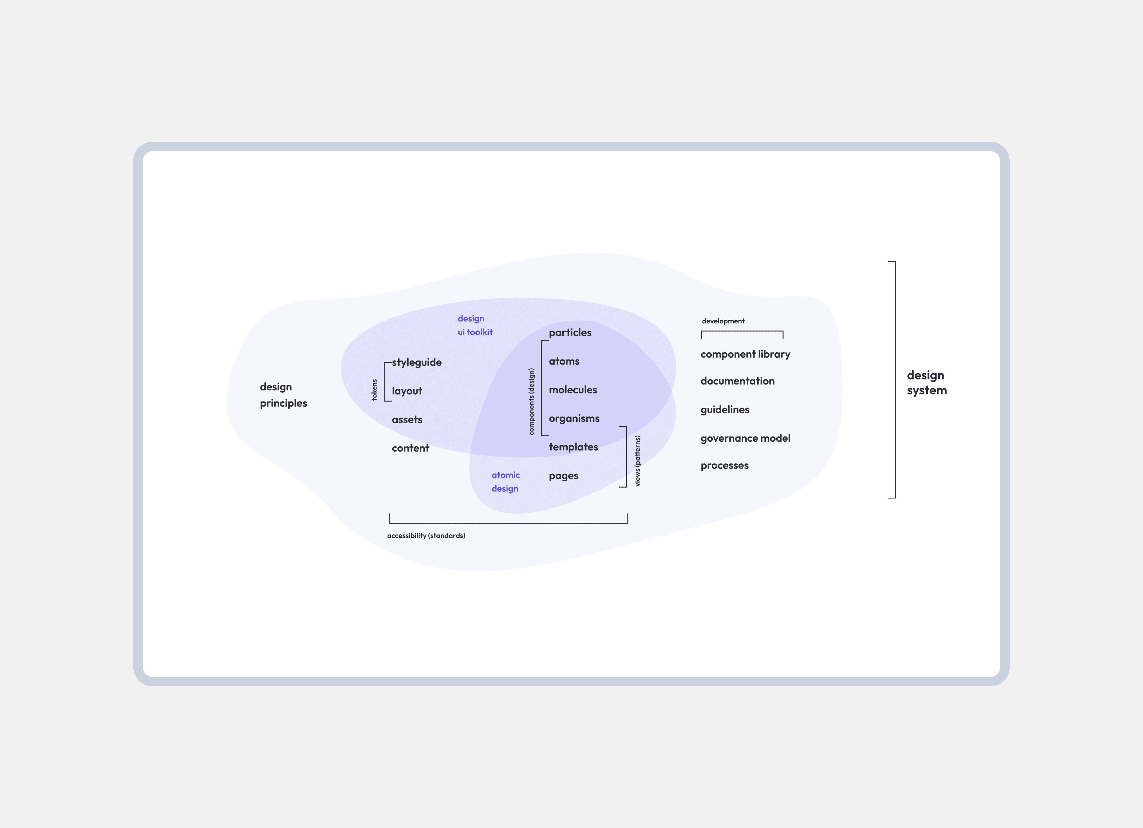
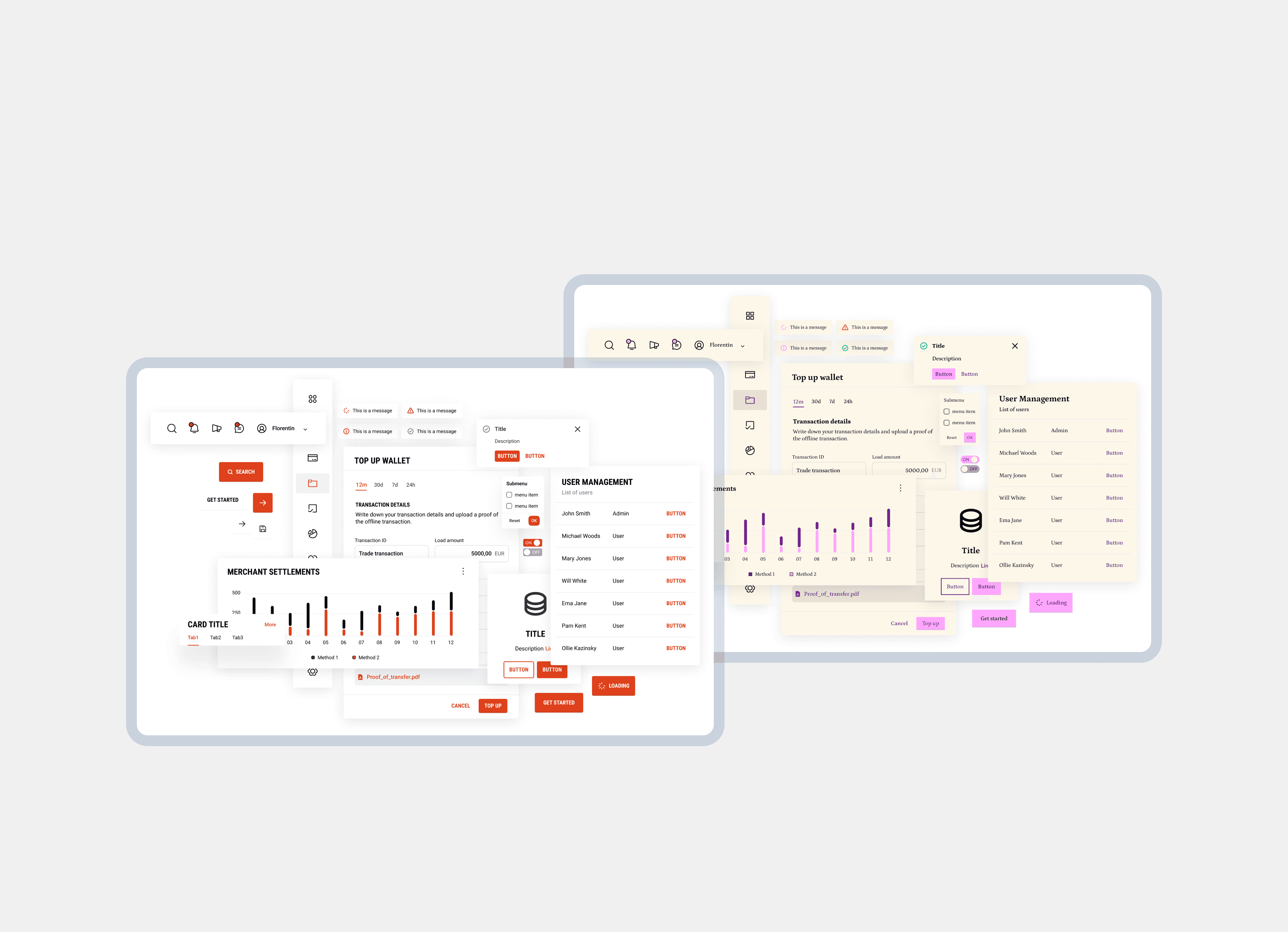
BEEQ Design System is a core design infrastructure that aligns teams around shared standards and reusable components, enabling consistent, accessible, and scalable product experiences. Release 1.0 focused on establishing clarity, governance, and velocity across design and engineering.

From the project’s inception, I proactively contributed to this internal initiative alongside a commercial project. I established the foundational design tokens and led the creation of a scalable, well-documented component library. I remain responsible for the ongoing governance and evolution of the design system, ensuring consistency and alignment with the latest Figma variables and workflows.
Role
Design System
Designer
Team
3x Design System Designers
8x Engeneers
Impact
Reduced design and development effort across multiple client projects
Accelerated delivery of white label products through reusable foundations
Enabled consistent, high quality experiences across brands and platforms
Improved collaboration between design and engineering teams
Established a scalable design system supporting future growth and customization
Problem area
When fragmented design systems slowed delivery and increased cost
For each new project, designers at Endava were required to create a new design system or UI kit from scratch, often in parallel with development and sales efforts. While necessary, this approach introduced repeated work, inconsistencies, and inefficiencies across projects.
Instead of accelerating delivery, teams spent valuable time rebuilding foundational elements, slowing design cycles, increasing costs for clients, and making it harder to scale solutions consistently across engagements.
Problem 1
Designers repeatedly rebuilt core UI foundations, consuming time that could have been spent solving higher-value product problems.
Problem 2
Lack of shared standards led to inconsistent interfaces across projects, increasing handoff friction between design and development teams.
Problem 3
Custom built UI kits for each project increased delivery costs and reduced reusability, limiting scalability for both clients and internal teams.
Design goals
What I aimed to achieve
Accelerate delivery
Reduce repetitive work and speed up design and development with a reusable system, targeting a 40% effort reduction.
Enable consistency
Establish a single source of truth through shared components and guidelines, documented in Zeroheight.
Build confidence
Provide clear tokens, patterns, and documentation that make decisions predictable and implementations reliable.
Design decision 1
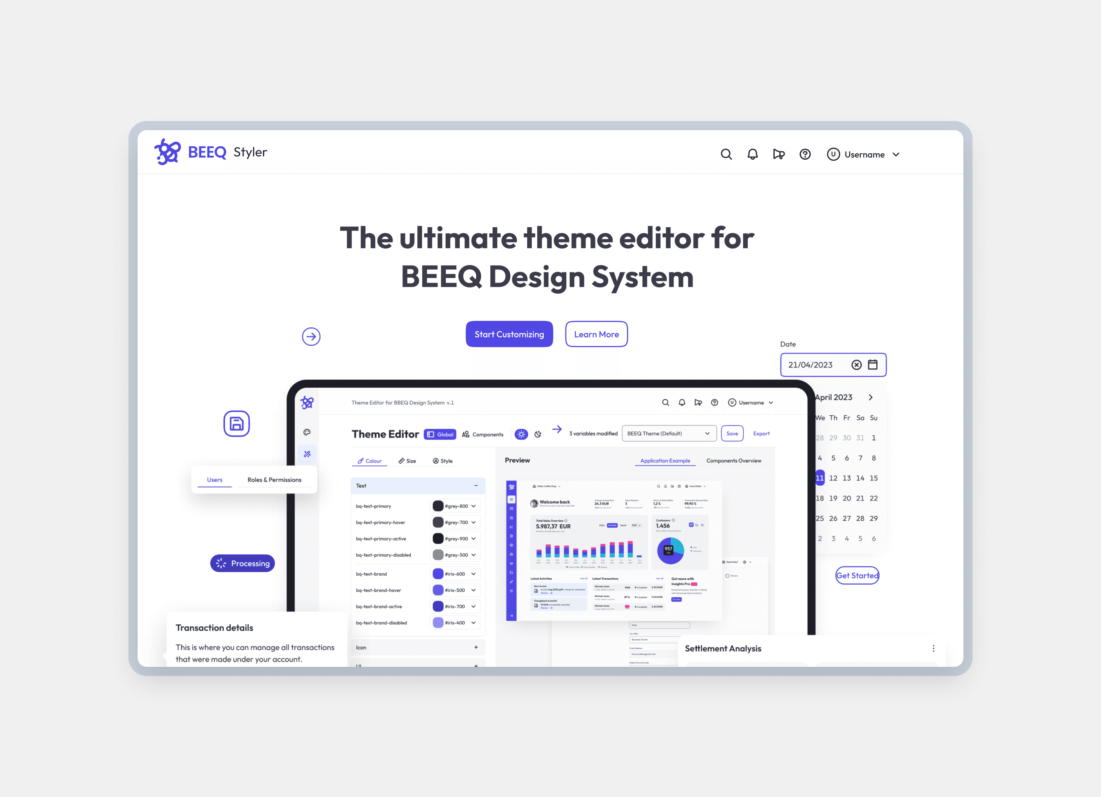
Enabling multi-brand theming through design tokens
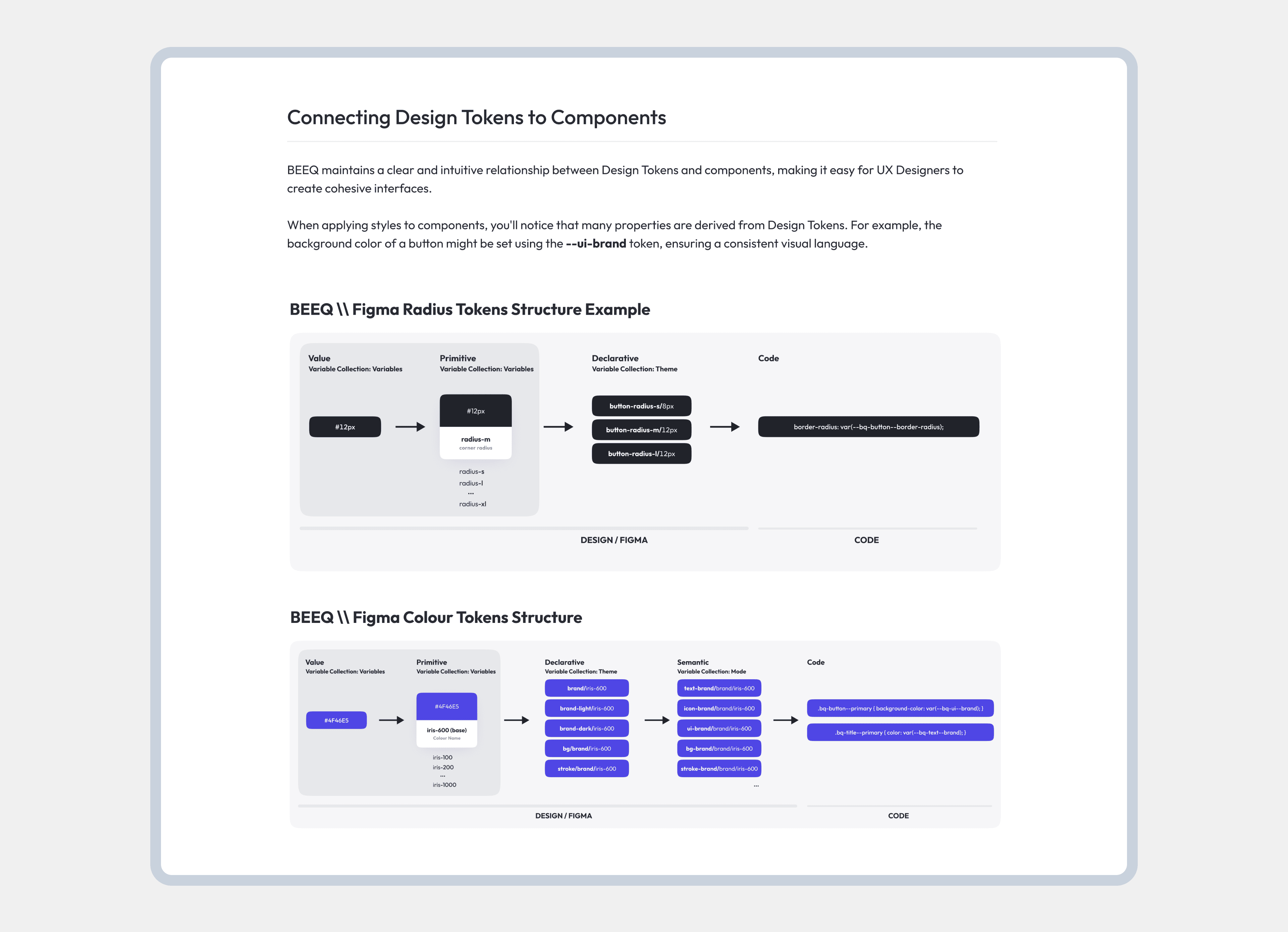
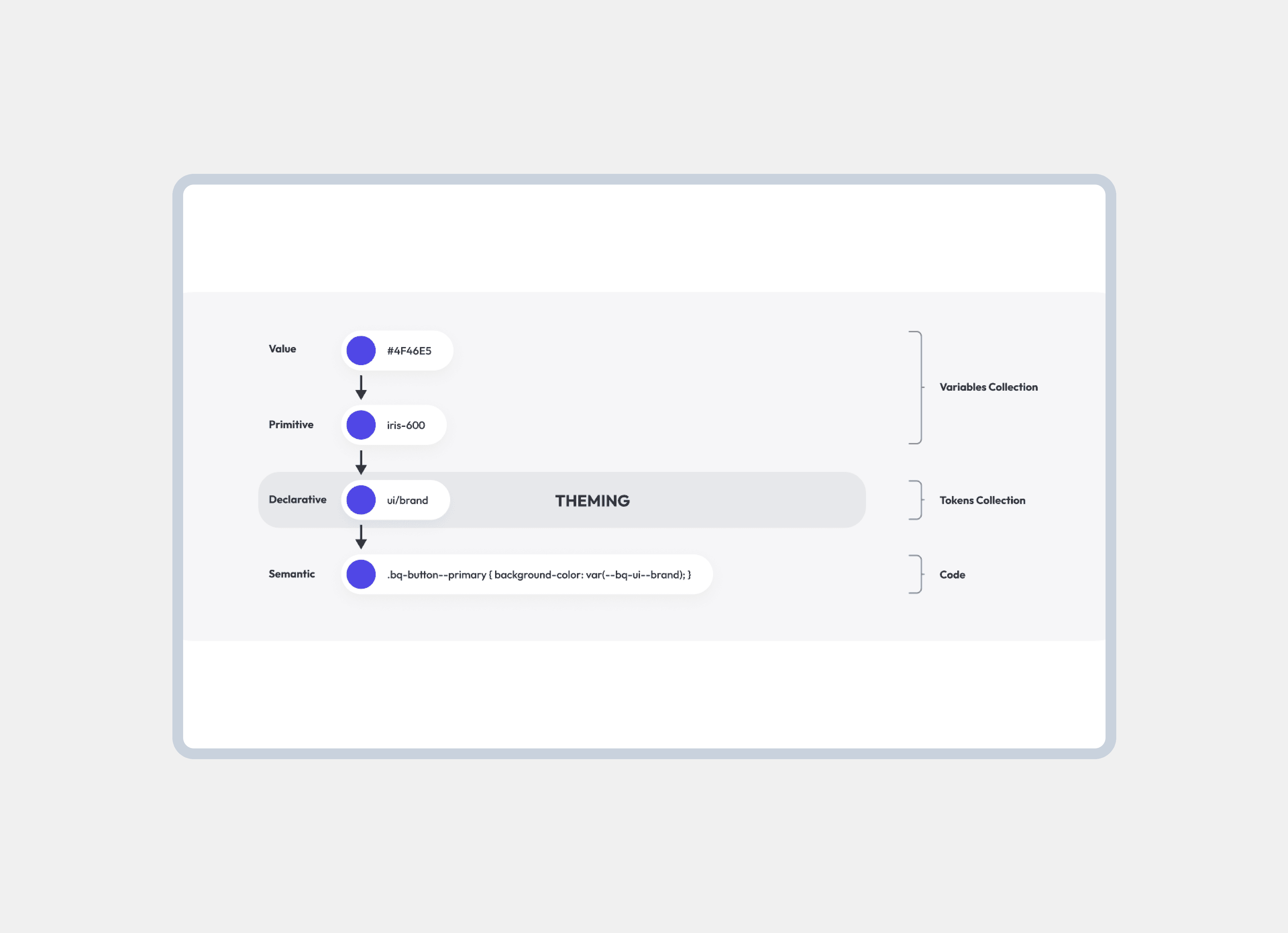
To support Endava projects with different brand identities, I built the design system on a flexible token architecture. Designers can switch between Bee-Q, Endava, or Custom themes with a single click, without rebuilding components.
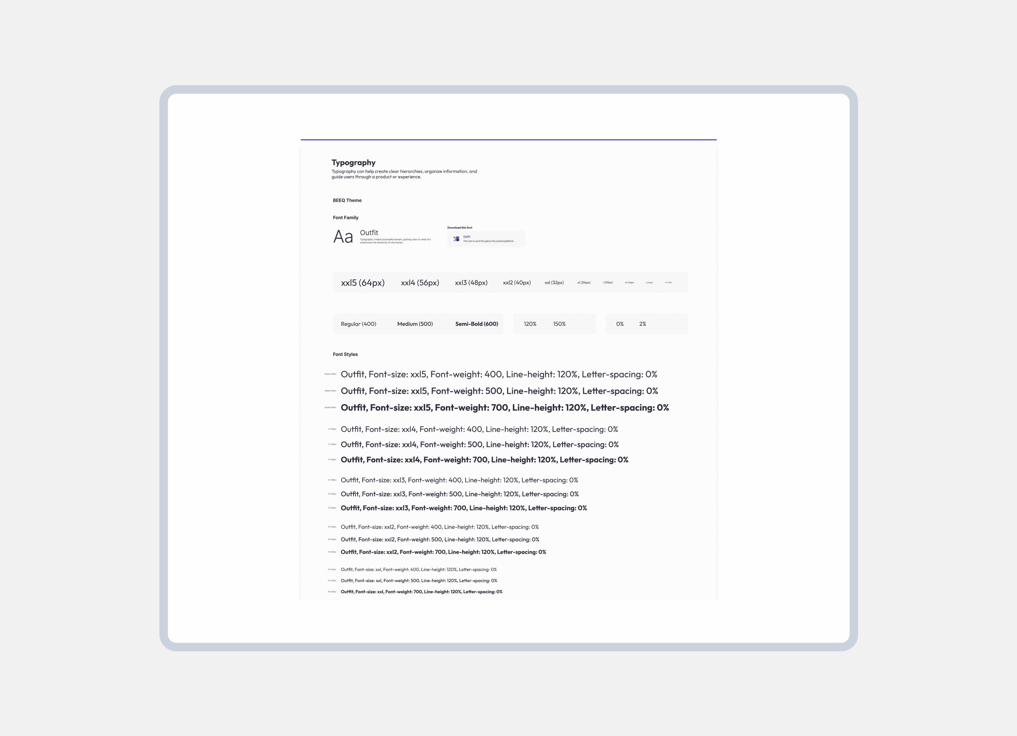
By centralising colors, typography, spacing, radii, shadows, and strokes into configurable tokens, teams can quickly adapt the system for multi-brand and white label products, reducing setup time while ensuring visual consistency and scalability across projects.
Design decision 2
Supporting light and dark modes with scalable tokens
To respect user preferences and usage contexts, I implemented a fully token based light and dark mode system. Thanks to the shared variable structure, users can switch modes instantly with a single click, without breaking visual consistency.
Each mode is synchronised across all themes (Bee-Q, Endava, and Custom), ensuring accessibility, contrast, and brand alignment. Clear documentation enables teams to extend or customise modes independently, making the system flexible, future proof, and easy to maintain at scale.

Design decision 3
Centralising documentation to enable scale and adoption
To ensure the design system could be adopted and maintained across teams, I centralised all documentation in Zeroheight. This created a single source of truth where designers and developers can easily access patterns, guidelines, usage rules, and linked code references.
By pairing components with clear explanations and best practices, the documentation reduced onboarding time, minimized misalignment between design and development, and empowered teams to work independently while staying consistent with the system standards.

Design decision 4
Validating the system through real-world usage and iteration
Rather than treating the design system as a static deliverable, I validated it through continuous use in commercial projects and RFP design concepts. Designers actively applied the system in real constraints, uncovering gaps, edge cases, and opportunities for refinement.
Feedback from hands-on usage and lightweight testing informed ongoing improvements to tokens, components, and documentation. This iterative approach ensured the system remained practical, adaptable, and trusted, evolving alongside real project needs instead of theoretical assumptions.

Retrospective
Designing a system built to grow beyond its first release
The first release of the design system established a strong foundation for consistency, efficiency, and reuse across projects. By centralising tokens, components, and documentation, teams were able to move faster with greater confidence, while reducing repetitive work and design debt.
Looking ahead, the focus shifts from consolidation to scale. The next phase involves extending the system across multiple platforms, including mobile, TV, and smartwatch interfaces, ensuring a cohesive experience across all touchpoints. In parallel, opening the system to the Figma Community will allow it to reach a broader audience, encourage collaboration, and evolve through shared learnings from designers and developers beyond the organisation.
This evolution positions the design system not just as an internal tool, but as a long-term product, one that grows with both the teams who use it and the platforms it supports.
Impact
Faster concept delivery
Teams could rapidly build and validate concepts, accelerating early-stage design and enabling quicker alignment with stakeholders.
55% effort reduction
Reusable tokens, components, and patterns significantly reduced repetitive work, helping the teams to focus on higher-value problems.
Scalable white-label
The system enabled easy brand customisation, allowing products to be adapted for multiple clients and markets without rebuilding from scratch.